Locomoco Space, Simplify
Browsing Navigation Patterns
Web App
UX Research
Component Design

CONTEXT
Challenges
Why isn’t there a platform that bridges learning with practical experience for aspiring early-career creatives?
My Vision
In an era where society is drawn to flashy end results and superficial achievements, I started Locomoco with a vision to create a safe space where designers and developers can explore ideas, grow their skills, and build meaningful connections.
PROBLEM STATEMENT
How might we design a simple starting point to help users move beyond mindless scrolling and easily discover content through shared values and common goals?
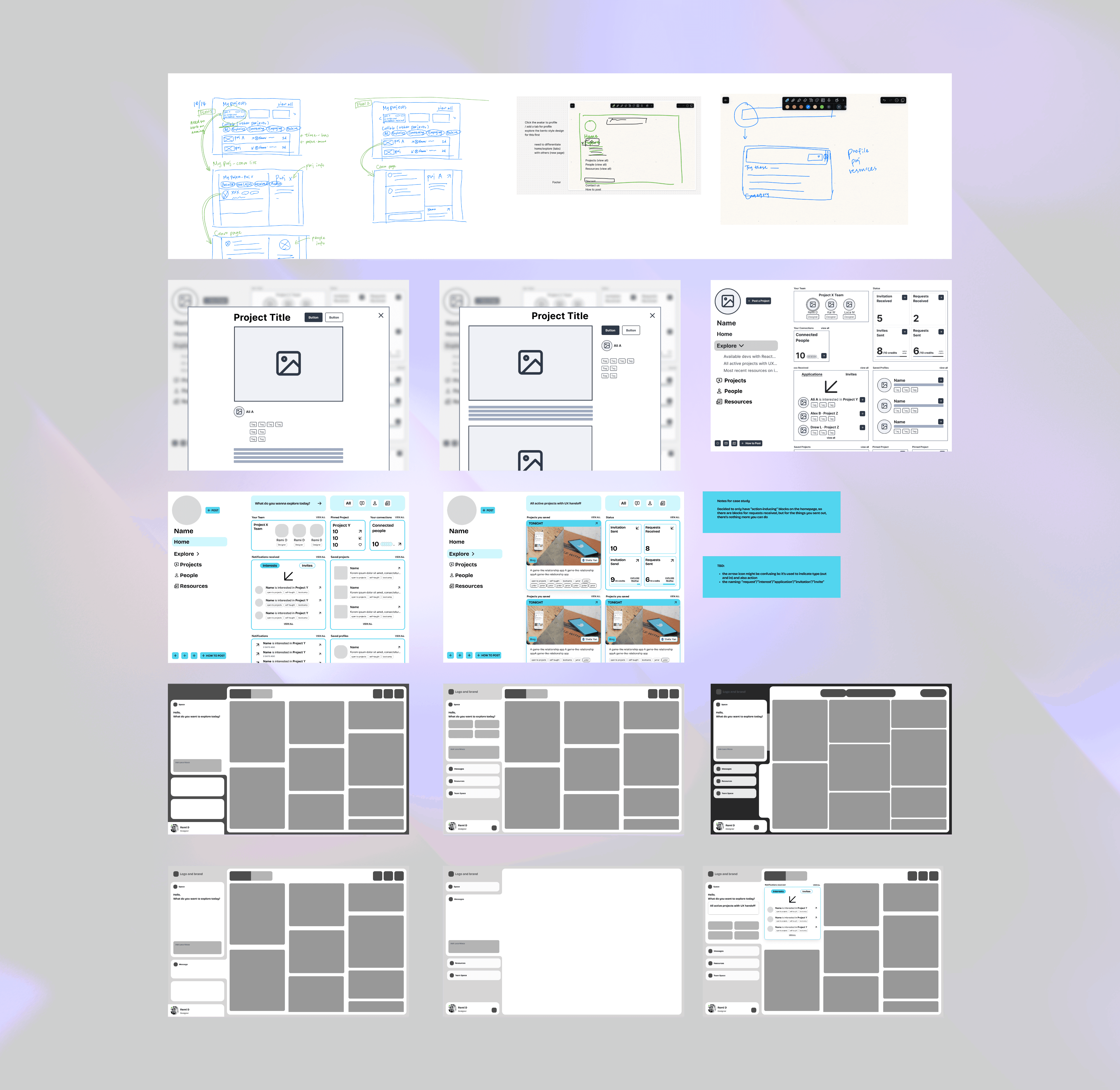
HOW DID I GET HERE?
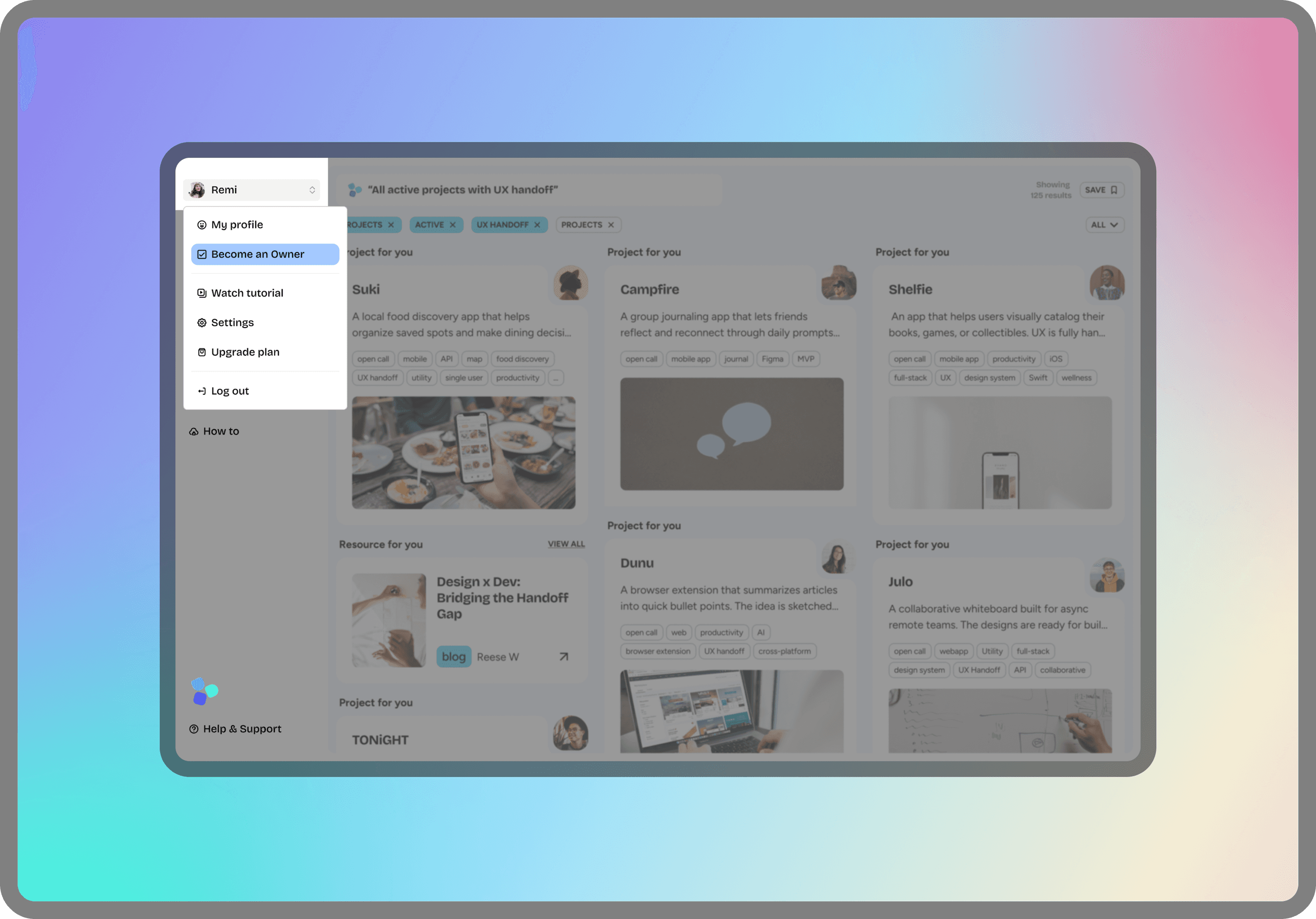
INTRODUCING LOCOMOCO SPACE
The space is the heart of the Locomoco. It moves away from traditional portfolio-driven browsing metrics and introduces a simplified discovery experience with an organized Bento layout. It curates content based on users' real interests, ensuring they see exactly what aligns with their needs and preferences.
FINAL DESIGN
Users enter the platform with specific goals. To design an effective landing page, it’s essential to understand the key actions that drive users to the platform. Through research, I identified three most common daily activities:
Explore
Relevant projects and partners in an intuitive way
Access
All spaces with smooth navigation patterns
Sync
With existing contacts and engage with ease
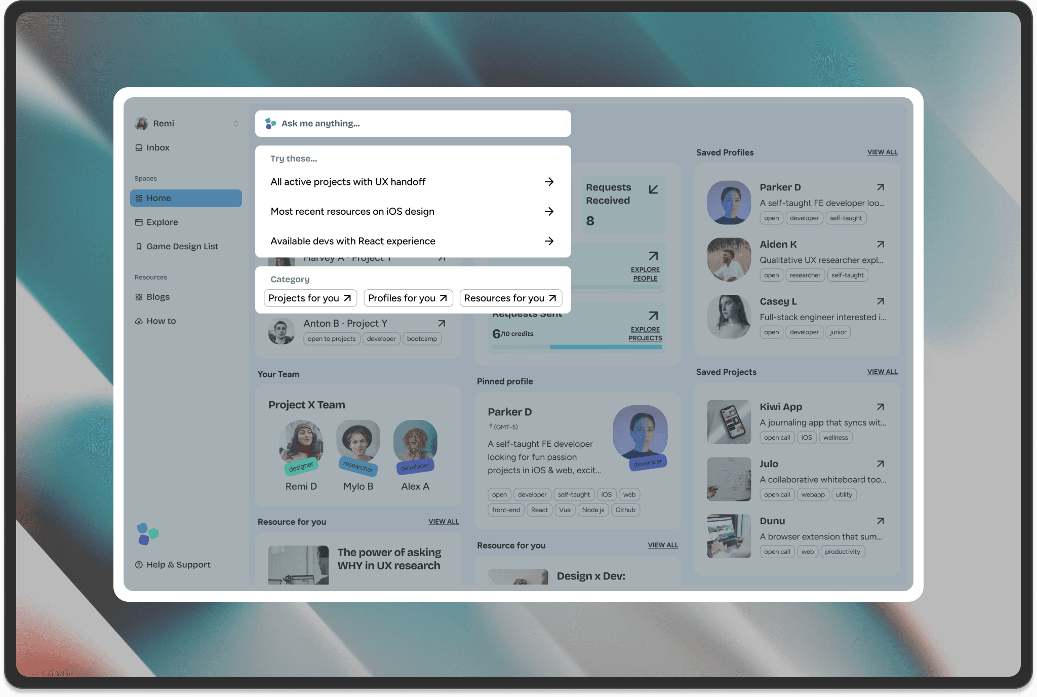
Intuitive Way to Explore Relevant Projects and Seek Partners
USER SCENARIO
Users need an easy and efficient way to find and connect with projects and individuals that align with their interests.
SOLUTION
Users simply describe what they are looking for, and our Moco AI Engine will provide personalized project and profile recommendations.
Smooth Navigation Between Spaces
USER SCENARIO
Users need to access resources efficiently without disrupting their original flow within the platform.
SOLUTION
The tab-based navigation system allows users to switch seamlessly between pages without losing context or progress, ensuring they can access resources whenever needed.
HOW DID I MAKE THESE DESIGN DECISIONS?
How to design a dashboard that decentralizes the focus on visual aesthetics and polished experiences.
SKIP TO DESIGN SPECIFICATIONS
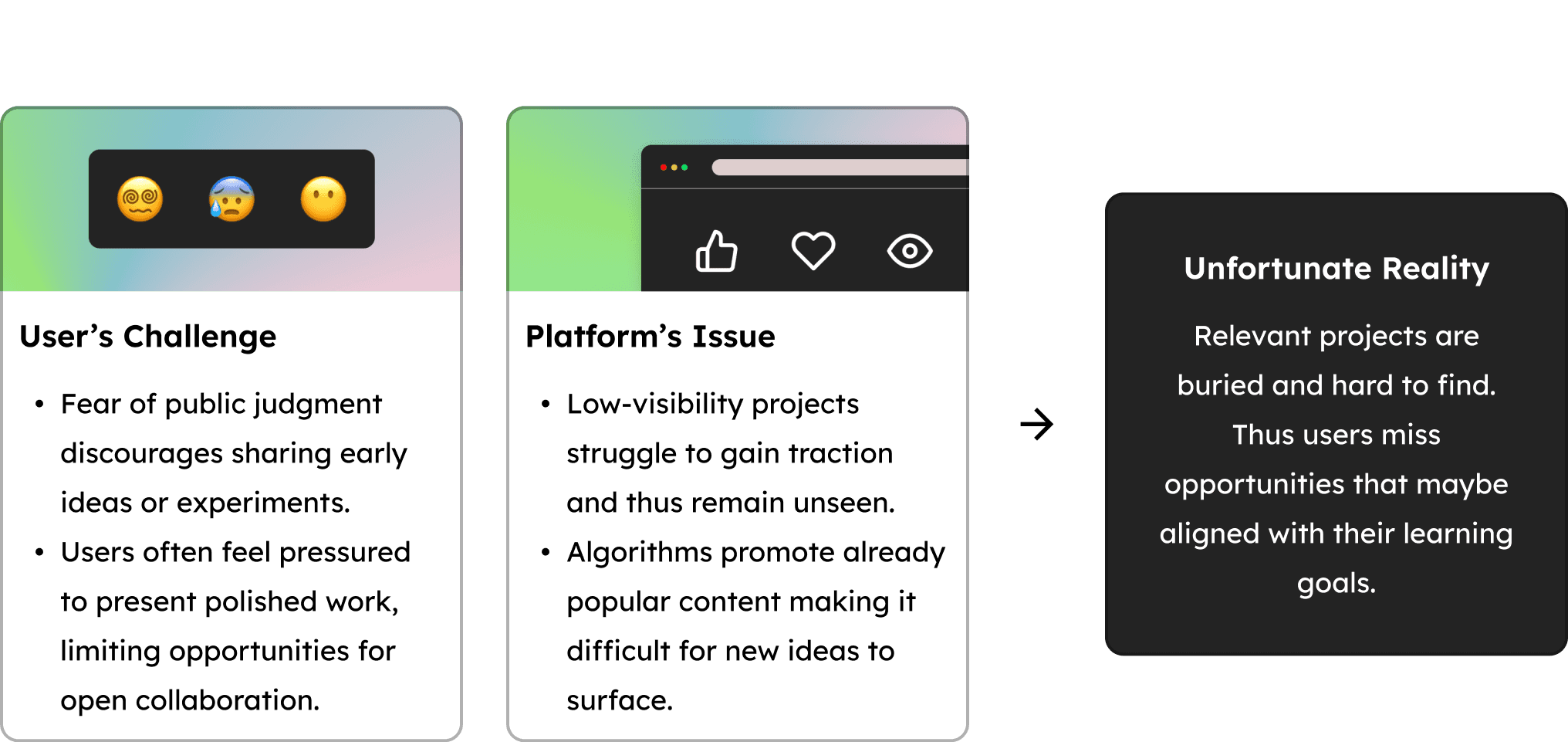
Our Challenges
Existing platforms often promote content aligned with users’ past interests or popular trends, limiting discovery paths and reinforcing biases. This creates a narrow experience where only visually striking work gains visibility, excluding innovative ideas and early-stage projects.
The dashboard aims to overcome these biases by allowing users to explore projects and collaborators through shared ideas, values, and creative processes more directly.
Start With Research
To address these challenges, I conducted three levels of research with distinct objectives:
Secondary Research
To Understand culture and industry trends.
User
Research
To Identify user needs, motivations, and personas.
Design
Research
To Test usability and validate feasibility.
To Understand
Culture and Trends
Secondary Research
Competitive Analysis
To deepen my understanding of the industry and validate these challenges, I conducted a secondary analysis of the tools currently available in the market.
Reality of the Current Market
I found that existing platforms set an unreasonably high bar for emerging designers and developers, limiting their ability to experiment, learn, and grow through mistakes. Some common problems are:
Networking is driven by followers and likes
Algorithms favor trending works.
Limited discovery paths reinforce familiar content, reducing exploration.

To Identify user needs
and motivations
User Research
24
User
Surveys
6
SME Interviews
Surveys and Interviews
To guide the initial design direction of the platform, I conducted 24 surveys and 6 key SME interviews targeting:
Emerging designers
Early career developers
Senior creative professionals.
Approach
While the dashboard is just one of the features within the broader system for the platform, it draws upon these key findings from the research to address user needs effectively and streamline the collaborative experience. And here is what we found.
INSIGHT 01
Motivation driven by learning goals and interests
Users are driven by hands-on projects that help them develop new skills. However, many struggle to find projects that can match their learning goals and personal interests.
INSIGHT 02
Social Media -> Tool
Many users feel overwhelmed by the inefficiency of existing platforms like Behance, Dribbble, or LinkedIn for their social media-like experiences.
These platforms often lead users down a distracting path when browsing endlessly. Users are looking for practical tools for project discovery.
“You cannot mandate productivity; you must provide the tools to let people become their best.”
INSIGHT 03
Strong Desire for Collaboration
Users expressed a strong need for collaborative projects. Additionally, Subject Matter Experts (SMEs) emphasized that more collaboration opportunities would significantly enhance their professional growth in the early years.
However, both groups currently lack the necessary connections to collaborate effectively.
"Finding the right resources to start a project is challenging if you don't have much experience. Passion projects are hard to manage because there is no one to keep you accountable if you're working on your own."
Guan.A - Early Career Developer
To Understand
Users
User Research
Personas
Through a combination of survey data, secondary research, and exploratory interviews with 8 participants — designers and developers across various roles and career stages — it became clear that users share common motivations and needs. Despite their diverse backgrounds, their feedback highlighted overlapping ways they would engage with the platform.

KEY FEATURES

Content Blocks
Easy to engage,
Hard to miss out

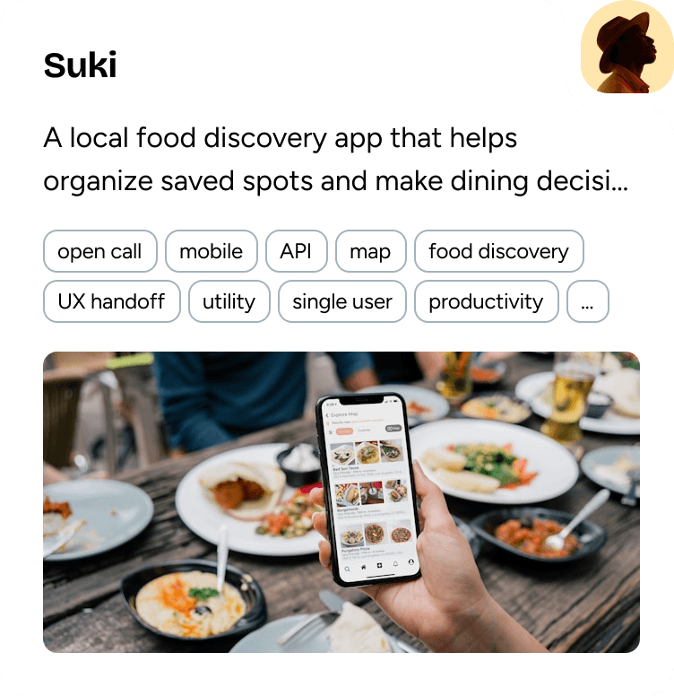
Project
Profile
Resources
Side Navigation
Navigate between spaces without friction


Content Search
Quickly filter and sort for curated content
Become A Owner
Publish your own projects
DESIGN PROCESS